Metro Area Data Dashboard shows entrepreneur activity and diversity in 50 largest metro areas across the country in 2014 and 2016.
Forward Cities Research and Evaluation Team strives to maintain a pulse on entrepreneurial ecosystem data. We want to understand the makeup of the business owner community and whether they demographically reflect their local population. As a part of this effort, we partnered with a team of students from Duke's Master of Quantitative Management (MQM) program to develop dashboards containing entrepreneurial ecosystem health indicators. The dashboard below contains indicators from the top 50 most populous Metropolitan Statistical Areas (MSAs) across the nation in 2014 and 2016.
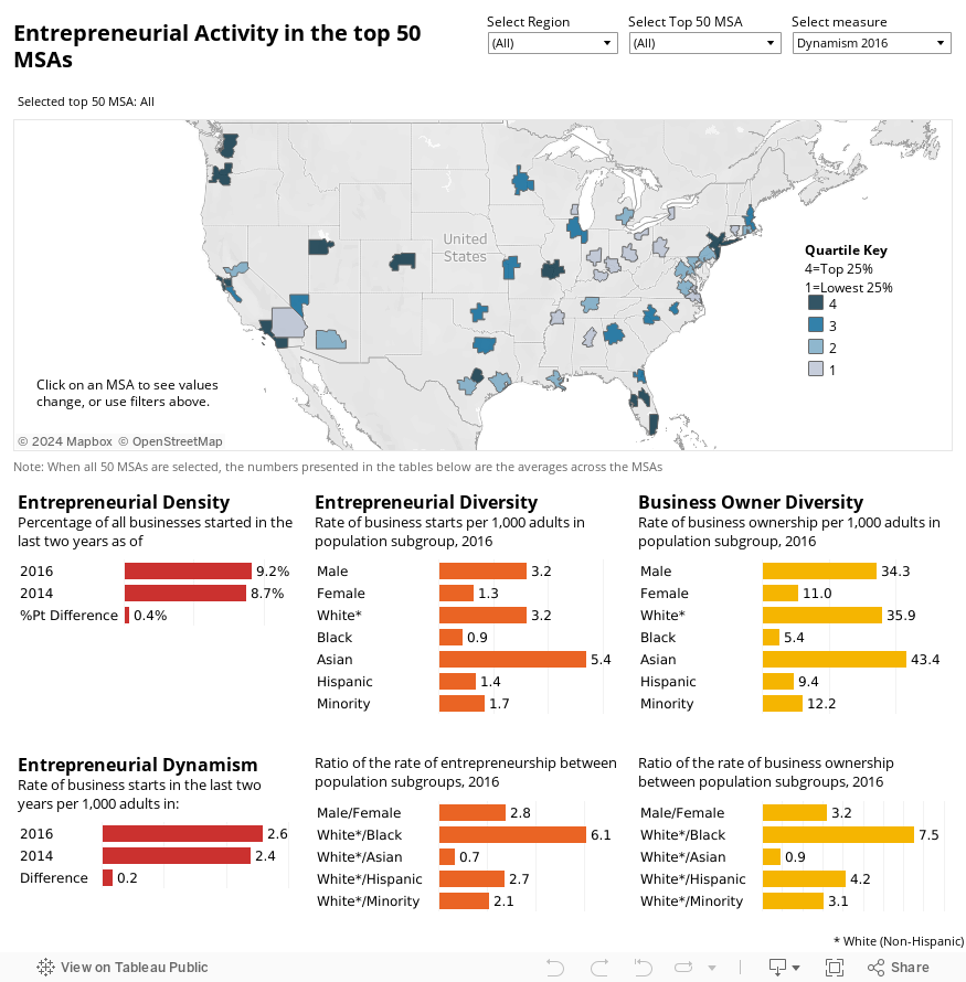
The dashboard combines data from the Annual Survey of Entrepreneurs with population estimates from the American Community Survey. Both are Census Bureau instruments. The dashboard contains four key indicator sets underneath an interactive map.
1. Entrepreneurial Density
The percentage of all businesses started in the last two years as of 2014 and 2016. This shows how large or small the new business community is out of all businesses.
2. Entrepreneurial Dynamism
The rate of business starts in the last two years per 1,000 adults in 2014 and 2016 - and the difference in rate between years. This shows whether young businesses are growing in number or declining. Since new businesses are a cornerstone of a healthy economy, tracking these shifts is crucial.
3. Entrepreneurial Diversity
The rate of business starts (defined as businesses under two years old) per 1,000 adults in the population subgroup. By adjusting the number of new business owners by the number of individuals from each race and ethnicity in the MSA population, we can compare the rates between population groups of different sizes.
The ratio of the rate of entrepreneurship shows gaps that exist in new business starts. For example, the average rate of business starts across the top 50 MSAs is 2.8 times higher for males (3.2 per 1,000 individuals) compared to females (1.3 per 1,000 individuals) and 6.1 times higher for White (3.2 per 1,000) than Black (0.9 per 1,000) individuals.
4. Business Owner Diversity
The rate of businesses per 1,000 adults in the population subgroup. This indicator includes businesses of all ages, in contrast to entrepreneur diversity which is specific to businesses less than 2 years old.
The ratio of the rate of business owner diversity shows gaps that exist in business ownership. The average rate of businesses across the top 50 MSAs is 3.2 times higher for males (34.3 per 1,000 individuals) compared to females (11.0 per 1,000 individuals) and 7.5 times higher for White (35.9 per 1,000) than Black (5.4 per 1,000) individuals.
Navigating the Dashboard
The dashboard contains filters, a map of the U.S., and a set of bar charts. If you select a specific MSA, either by using the filter at the top or by clicking on the specific MSA on the map, you will see the indicator sets below the map adjust to reflect only the metrics for that area. If an individual MSA is selected via the drop-down menu at the top, the map will zoom in and show the specific metrics for that MSA. If you wish to return to view averages on a metric across all 50 of the top MSAs, simply select “all” on the MSA filter. If you hover your cursor over the map, you will see a set of options for zooming, searching locations, and resetting the view. You can also hit the house icon to return to the base layout, or refresh the page. See our short video to see how to navigate the board.
Comparing Indicators Across MSA
In addition to a close look at an individual MSA, you can compare MSAs across the country on one of four key 2016 indicators: Entrepreneurial Density and Entrepreneur Diversity for White (Non-Hispanic), Black/African American, Asian, and Hispanic populations. The lightest colors on the map show MSAs with the lowest rates (bottom 25%) while the darkest colors show MSAs with the highest rates (top 25%) for the selected indicator. When you filter to a different indicator, the color of the MSAs will change based on the quantile in which the MSA falls. As you explore the differences in the key indicators across the MSA, notice the additional information provided in the tooltip (hover over an MSA with your mouse to see), including the population size and the distribution of the population according to race and ethnicity.
Now that we’ve shared how to get around the dashboard and its contents, explore it for yourself. Play with the filters and learn more about metrics in a specific MSA or the variation across MSAs. Tweet us your thoughts at our Twitter handle, @Research_FC. We look forward to hearing from you.
A big thank you to Luke Hartman V, Linus Keiler, and Michael Zingone for drafting the dashboards and blog post.