County-Level Business Data Dashboard Elevates the Census’ Most Recent Annual Business Survey Results
Following the recent blog on metro area business statistics, the Forward Cities Research team would like to share our county-level business statistics dashboard. This dashboard, modeled off of the MSA version which was drafted by Duke University’s Master of Quantitative Management (MQM) students, highlights inequities in business ownership, sales, and employees at the county level. A special thank you to Stacey Williams, the Director of Research and Evaluation, for developing the measures included here and for guiding the development of the dashboard with the Duke students and Forward Cities research team.
The data presented in this dashboard combines publicly available data estimates of business ownership and business characteristics generated from two comparable Census Bureau surveys, the 2017 Annual Business Survey and the 2012 Survey of Business Owners. These data are combined with population estimates from the American Community Survey to derive population-adjusted ownership rates. There are four indicator areas on the dashboard: Business Ownership Rate overall and by subgroup, Employer Firms, Average Sales, and Average Employees (in bar charts under the map).
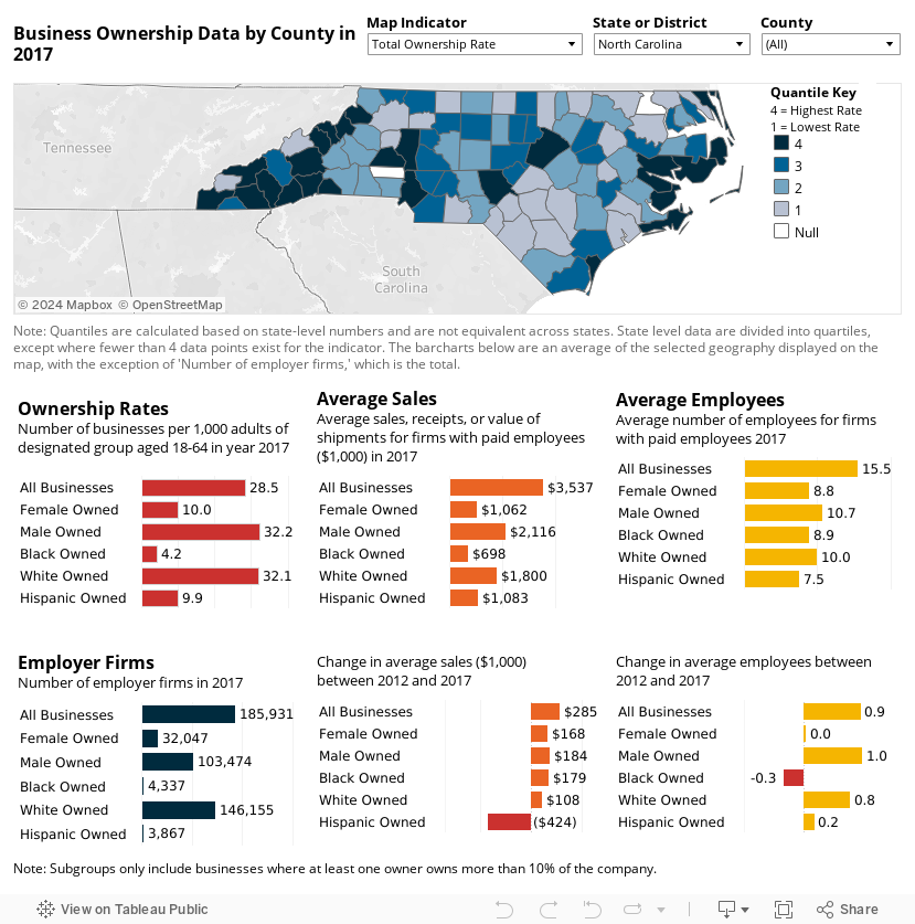
The interactive map contains the following information:
Total Rate of Business Ownership
This is the default indicator on the map, which shows the number of businesses per 1,000 working age (18-64) adults in the population. In Wake County, NC, for example, there were about 35 businesses per 1,000 working-aged adults in 2017.
Ownership Rate by Subgroup (female, male, Black, White, Hispanic)
This rate is weighted by population size and is defined as the number of businesses per 1,000 working age (18-64) adults of the specific population subgroup. In Chatham County, NC, for example, there were about 12 female-owned businesses per 1,000 working-aged females adults.
In addition to Ownership Rates, bar charts below the map show the following indicators:
Employer Firms
Defined as the number of nonfarm firms with paid employees and receipt sizes over $1,000 in 2017. The Employer Firms indicators are counts not weighted by population size.
Average Sales
Equate to the sales, value of shipments, or revenue of employer firms, in 1,000s. The two indicators in this group are:
- Average sales by subgroup, 2017, and
- Change in average sales by subgroup between 2012 and 2017.
Average Employees
Derived from the number of paid employees at employer firms. The two indicators in this group are:
- Average employees by subgroup, 2017, and
- Change in average employees by subgroup between 2012 and 2017.
Navigating the Dashboard
The dashboard contains several controls for displaying the data. There are three visible at the top, and a few available by clicking. Filter the map as well as the bar charts below by changing one of the “State or District” or “County” filters. The “Map Indicator” filter only impacts the data displayed on the map. If you hover your cursor over a county, indicator and population data will show in the box, known as the tooltip. If you click on a county, the map will zoom into that area. To go back, click on an area on the map outside of the selected area. Watch the video tutorial in this blog for a live walkthrough of the functionality.
The default landing page shows the Total Ownership Rate indicator on the map, and the indicators for the state selection. For any indicator selected, quartiles for that indicator are displayed using data for only the selected state, and so quartiles in one state are not the same as another state. States with fewer than 4 data points for the selected indicator show quantiles based on the number of available data points. The darkest areas have the highest rates of ownership. The areas labeled as “null” do not have data available, most often due to the small population size or an inadequate sample size for publication per the Census Bureau requirements.
Now that we’ve shared how to get around the dashboard and its contents, explore it for yourself. Play with the filters and learn more about metrics in a specific county, or across a state. Tweet us your thoughts at our Twitter handle, @Research_FC. We look forward to hearing from you.